Over the years I've screen printed, or silk screened if you will, plenty of designs that I've liked which haven't really otherwise been available. I've been meaning to record the prints I've done for quite a while and blogging has seemed to be the easiest way, but I've been kinda lazy about it.
Luckily my mate Daniel juts recently asked me about screen printing and even if I mailed him how to do it I thought that it would be a nice idea to finally start the blog and begin it with explaining how the printing is done. Pictures tell a more than a thousand words and all that...
So a couple of weeks ago I finally decided to print a design that I've been meaning to do for like a year or so. I tried to document the whole process by taking photos where appropriate.
For the interested people there is a wikipedia article on screen printing and youtube also has plenty of clips on the subject although in vast majority of these people use light reactive emulsion to transfer the images to the screen whereas I've always been using a paper stencil.
The emulsion method is good and fine especially if you want to screen plenty of copies of the picture or if the picture is very intricate and don't mind messing a bit with some chemicals. But the picture is transferred permanently to the screen until you wash it away with solvent. If I want to do more than copy of the print I do several at the same time with a paper stencil or If I think I need to do a printing later on I use a transparent film. So in this blog we're going to stick with the more primitive and somewhat cruder method of transferring the image. Perhaps one day I'll try the emulsion method.
Years ago I bought all my tools from a local craft shop and the main tools and paints are all from a local brand, Seriväri. I've been happy with them but I'm sure other available brands shouldn't differ that much from theirs. Also their store is quite conveniently located next to School of Arts, Design and Architecture at Arabia Campus in Helsinki.

Here's a sample of different Seriväri paint jars. Since I tend to print on black t-shirts I use opaque colors. The big jar is white, there's several other shades in smaller size and on front the smallest size in different packaging that has changed during the years. I think that the second from right is the current type and most certainly beats the old glass jars which tend to not to be that airtight and thus cure in the jar prematurely.

When you don't use the colors that often they might cure a bit or at least the pigment might separate itself from the thinner a bit. Usually stirring the paint helps but if the result still is clumpy just apply the paint to screen and with the move it around with squeegee for a while and it should in most cases return to more or less good order. If the thinner has evaporated or the paint dried somewhat you can also purchase thinner you can apply to the paint to make it more runnier again. Although opaque paint is not runny per se, but more like a thick goo instead.
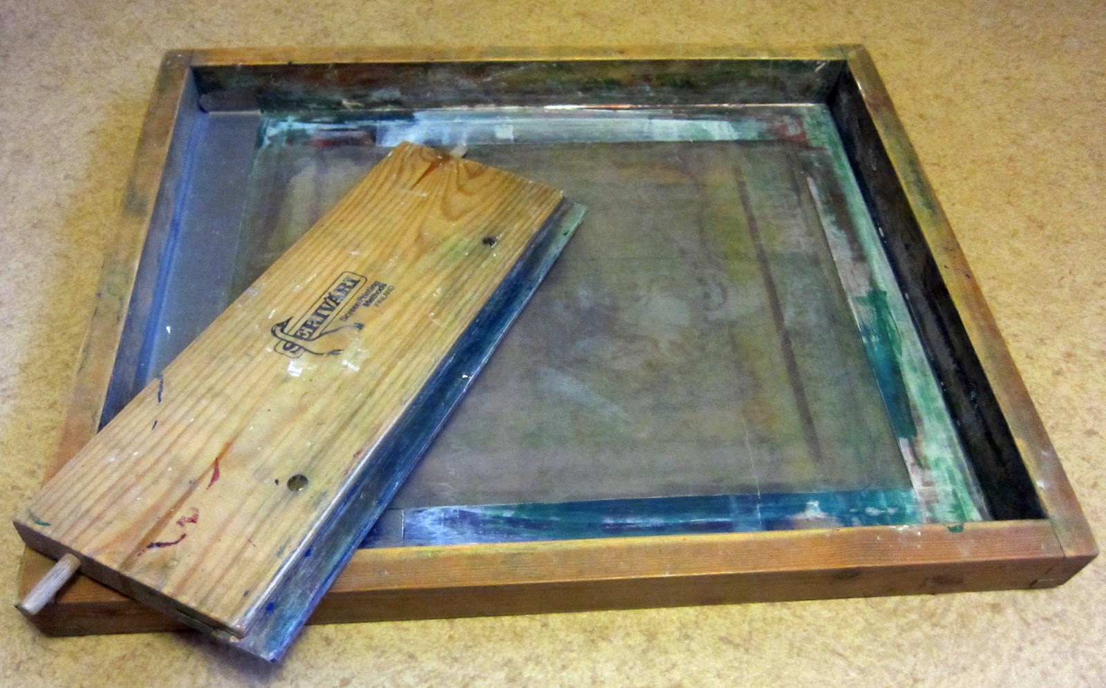
Below is the screen aka. the mesh and the squeegee. The screen is basically just a frame that has a fine mesh fastened to it. Also note that the area right next to the frame has been blocked with emulsion so it is easier to control where the paint will be going. Some time ago I cleaned my screen with a solvent used to removing the light-sensitive emulsion and paint and it kinda removed some of the borders too. So I used some good old duct tape for patching as you can see on the left. Screens and squeegees are available in different sizes and mine if roughly A3 sized. You could build one relatively easily yourself but at least 20 years ago I thought that these were really reasonably priced so I went for the pre-made ones.
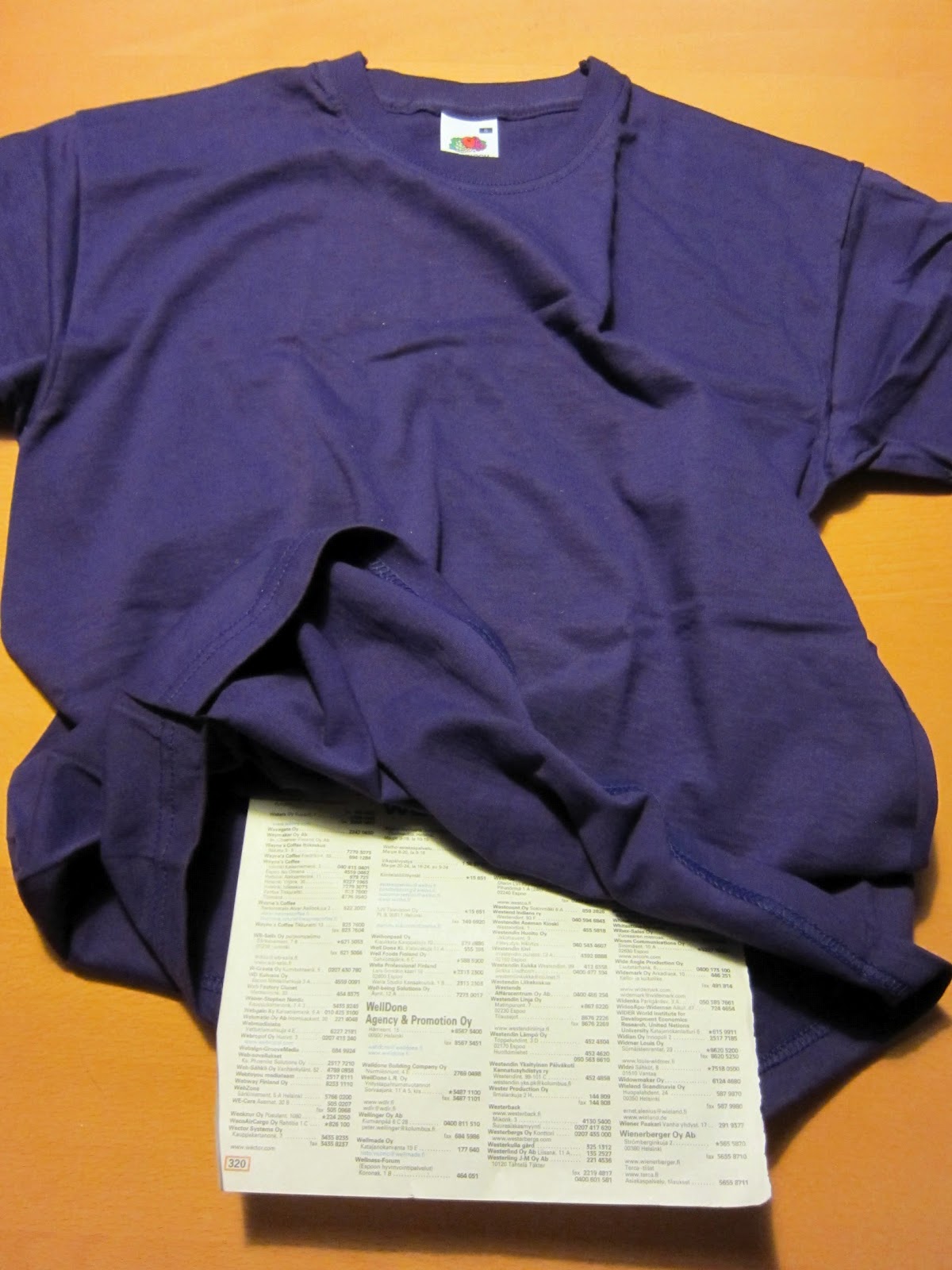
Some additional tools of the trade. Natural paper masking tape in a couple widths, and old butter knife to scoop the paint, X-Acto knife to cut the stencils and an old phone book to supply thin masking paper.

And finally you need t-shirts, or some other material, to print stuff on. Seriväri's store has an excellent selection of different types and colors of shirts, hoodies etc at very reasonable prices. Also you need prints, or photocopies, of the intended stencil.

Just for comparison here is an older stencil done in transparent film (actually the one I use is milky, not fully transparent). Years ago I bought a packet of these A3 size films from a photocopy store and I chose the milky one because I thought that the photocopy ink would adhere to it better than to fully transparent one. Since then I've noticed that it is somewhat tedious to use as, compared to paper, it most certainly is more difficult to cut and blunts the knife so much quicker. Cutting really miniscule detail is almost an impossibility as the film has a tendency to to suddenly break too -I'm not sure if the fully transparent film would've been less rigid and thus less prone to break.

To finish off the basics, here's a closeup on the stencil.

The image I'm going to produce is from DC's Superman comics and is a variation of the classic S-symbol the man of steel has on his chest. Plenty of hipsters and bimbos who don't know Superman from Garfield wear it on their clothes or even on their skin. I kinda want to confuse these posers and use the reversed one used by Bizarro, the imperfect clone of Supes.

Step 1. So here is the first stencil I cut out with the X-Acto knife for color yellow. You can see the cut out parts as tan/beige. A very easy and simple stencil that took just a couple of minutes to cut.

Step 2. I've placed the stencil on top of a A3 sheet and traced the outlines and the outlines of the cut out parts to it. Then, using small scissors I cut out slightly smaller section than the picture in above stencil was.

Step 3. Using the masking tape I fastened the stencil to the A3 sheet effectively creating one big stencil. Do not leave any openings for the paint in the masking tape!
You could print copy the needed picture on a larger sheet to skip steps 2 and 3. But my printer isn't big enough to print A3 sheets and, besides, sometimes the your picture is slightly in an off angle so this way you can re-position it to more comfortable one.

Looking at the above picture from the opposite side. No need to tape this side.

Step 4. Just to be secure, especially with thinner fabrics, it is a good idea to place something under the area to be printed as a mask in case the color seeps through. Opaque paints are somewhat thicker than non-opaques and thus less likely to do so, but I like to be sure and use a sheet from an old phone book. It is thin but it takes care of the job. you could use whatever is at hand (bakery paper sounds like a good choice) but just avoid papers that are wrinkled and these might show on the print.
Step 5. Place the stencil on top of the shirt on the spot where you want the picture to be. Take care so that it isn't at an odd angle.

Step 6. Place the screen carefully on top of the stencil taking care that the only exposed shirt area that shows is the one you cut out from the stencil.

Step 7. Apply the color to the screen. No need to use excessively much paint.

Step 8. At roughly 45 degree angle and moderately pressing it against the screen move the squeegee on top of the stencil...

...and you see the paint being smeared on the screen. You can do this a couple of times and even sideways if you want to.

As you can see from the wooden part of the squeegee I might've used just a tad too much paint.

Step 9. Now you take the screen off and the paint has been left only on the parts where the stencil had been cut open. Wash the screen clean from the excess paint with cold water, scoop what you can of the unused paint on the squeegee back to the jar and was the squeegee too.
I let the paint dry on the shirt for around half an hour or so. Then I repeated steps 5 to 9 with other colors.
Here is the stencil for black. Please notice that since there are some parts in the stencil that are completely surrounded by black and would fall off if all the black areas were to be removed, you need to leave thin strands that connect these areas to other outer areas and after printing you go through such areas with a paint and a brush (with the light-emulsion printing you don't need to worry about this enabling you to print far more intricate designs).
You want to avoid moving the shirt as much as possible since that way placing the subsequent stencils in the exact place they need to go will be MUCH easier.

Black has now been screened...

...and here are the results after I retouched the areas where the strands were. Sme parts of the black paint are still glistening due to still being wet. I could've stopped the whole process here as the final color will be purple but I wanted the purple on the S to be slightly different shade than the one on the on the rest of the shirt.

So here is the final stencil for purple. Here the strands are more visible. I made do with minimum number of strands even if it would've been wiser to use at least two stands per each section. That way the sections would've been less flimsy and positioning the stencil to the right place would've been easier. Then again I had less to retouch this way.

Step 10. Instead of just retouching the support strands you can also paint on the design.
Since the whole design looked kinda bland I decided to blend and highlight a bit by adding some white to purple and painting it on some areas. Followed by several other smaller layers with even more added white. The paint jar's stopper doubles as a nice mixing pallette.

As the highlighted S now looked very vibrant I noticed that the yellow was looking rather bland. So even if it was already dry I shaded the yellow parts with a bit with orange and highlighted it with white (actually both mixed with yellow).
You should try to do this when the paint is still wet as it will most likely adhere to the shirt much better that way. Also when blending wet paints the effect is somewhat more subtle even if it a bit more tricky to achieve.
Sometimes when you leave too little, or too much color on the screen the print isn't even and you might want to touch up that too. This actually happened with the yellow in the shirt and during that point I already contemplated blending the colors but decided against it. Hrumph...

So here is the finished product. The colors in the photo are somewhat off and the purple of the design doesn't differ so much from the shirt's color.

After all the colors have fully dried turn the shirt inside out. As you can see the yellow has seeped somewhat through.

Step 11. In order to make the paint fasten to the shirt you need to iron the shirt.
I've noticed that the more rigorously and longer you iron the shirt the better the colors will adhere to it. So especially when you iron the insides of the shirt keep the iron on top of the design for a good long while as to almost burn the shirt. The lighter colored fabrics you use the more difficult this is as the iron might actually discolor the fabric by burning it. Another reason to use black shirts...
After ironing the insides, turn the shirt inside out again and iron the outside too but now perhaps slightly shorter a time. And don't drag the iron around just press it where it needs to go and light it off and reposition.

Ta-dah! The finished product.

Identical twins, separated during bir... cloning process?

I like your input, thank you. scottncoffee@gmail.com
VastaaPoistaI like your input, thank you. scottncoffee@gmail.com
VastaaPoista